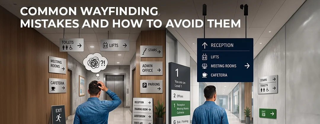
Common Wayfinding Mistakes and How to Avoid Them
A poorly designed wayfinding system can frustrate visitors, damage your brand, and even create safety risks. Yet many businesses across Doha invest heavily in exterior branding and overlook the internal navigation experience entirely. Here are the most common wayfinding mistakes — and how to avoid every single one of them.
1. Inconsistent Visual Language
One of the biggest wayfinding mistakes is using different fonts, colours, arrow styles, or icon sets across different signs in the same building. When visitors encounter inconsistency, they lose confidence in the system and become confused about whether they are still following the correct route.
Fix: Define a clear visual standard for your entire wayfinding system — consistent typeface, colour palette, icon set, and arrow direction conventions — before a single sign is produced. All indoor signages should follow this standard without exception.
2. Placing Signs Too Late in the Journey
Many facilities install directional signs only at decision points — junctions and corners — but not before them. This forces visitors to overshoot turns, backtrack, and feel disoriented.
Fix: Place advance warning signs before decision points, not only at them. A visitor approaching a junction needs to know where to turn before they arrive, not after they have already passed it.
3. Overcrowding Signs With Too Much Information
A sign that lists fifteen destinations is not helpful — it is overwhelming. Cognitive overload causes people to disengage and stop trusting the system.
Fix: Limit each directional sign to the most relevant destinations for that point in the journey. Typically, no more than five to seven destinations per sign is recommended. Use clear hierarchy to prioritise the most frequently sought destinations.
4. Poor Contrast and Illegible Typography
Signs that use low-contrast colour combinations or overly decorative fonts are nearly impossible to read quickly — especially for elderly visitors, people with visual impairments, or anyone moving at speed through a busy corridor.
Fix: Use high-contrast combinations (dark text on light background or vice versa) and clean, sans-serif typefaces. For illuminated signs, ensure the backlit or LED solution provides even, glare-free illumination.
5. Ignoring Bilingual Requirements
In Qatar, commercial and public facilities are required to display signage in both Arabic and English. Many businesses focus solely on the English text, resulting in non-compliant signs that may be removed by the municipality.
Fix: Ensure all wayfinding signs include accurate, professionally typeset Arabic text. Work with a signage company that has in-house Arabic language capability. Speedline Media produces all signage with certified bilingual text as standard.
6. No You-Are-Here Maps
In large, complex facilities such as hospitals, malls, and universities, directional signs alone are not sufficient. Without orientation maps, visitors have no sense of the overall layout and cannot plan their route.
Fix: Install you-are-here maps at key entry points and major junctions. These should be clearly oriented with north-up convention (or the most intuitive orientation for the facility), and should highlight the current location, emergency exits, and main landmarks.
7. Mounting Signs at the Wrong Height
Signs mounted too high are missed by people scanning at eye level. Signs mounted too low are blocked by crowds. Both reduce the effectiveness of the wayfinding system significantly.
Fix: Follow accessibility guidelines and mount signs at a height visible to the full range of users, including wheelchair users and children. Overhead signs in busy corridors should be large enough to read from a distance without requiring the viewer to stop.
8. Failing to Maintain the System
A wayfinding system installed five years ago may no longer reflect the current layout of your facility. Departments move, spaces are repurposed, and entrances change — but the signs stay the same.
Fix: Treat your wayfinding system as a living asset. Schedule periodic reviews — at minimum annually — and update any signs that no longer accurately reflect the current space. Speedline Media offers maintenance and update services for existing wayfinding installations across Doha and Qatar. Explore our full range of sign board solutions in Qatar.
9. Not Testing With Real Users
Designers and facilities managers know their buildings too well to accurately simulate a first-time visitor experience. Signs that seem obvious to staff may be completely unclear to a new patient, guest, or customer.
Fix: Before finalising your wayfinding system, conduct walkthroughs with people unfamiliar with the building. Their navigation challenges will reveal gaps in your sign placement, messaging, and hierarchy that desk-based review will never catch.
10. Treating Wayfinding as an Afterthought
Perhaps the most common mistake of all — planning the wayfinding system last, after construction is complete, as a box to check rather than an integrated design element. This results in signs that are retrofitted awkwardly, mounted in suboptimal locations, and disconnected from the building’s architecture and brand identity.
Fix: Involve your wayfinding signage partner at the beginning of the project. Speedline Media works with architects, interior designers, and project managers from the planning stage to ensure wayfinding is integrated seamlessly into the space. Our outdoor and indoor signage solutions are designed to complement your building — not fight with it.
Speedline Media & Advertising
📍 Al Jazeera Street, Bin Mahmoud, Doha, Qatar