
What Are the Best Colours for Wayfinding Signage?
Colour is one of the most powerful tools in wayfinding design. It can guide visitors instinctively, communicate urgency, differentiate zones, and reinforce brand identity — all without a single word. But the wrong colour choices can confuse, disorient, or exclude visitors. This guide covers everything you need to know about selecting the right colours for wayfinding signage in your facility in Doha or across Qatar.
Why Colour Matters in Wayfinding
Human beings process colour faster than text. Studies show that colour is identified before shape and before words in visual perception. In a busy hospital corridor or a crowded mall, visitors make split-second navigation decisions — often based on colour coding before they even read the sign text.
Effective colour use in wayfinding achieves:
- Zone differentiation: Using distinct colours to represent different areas or departments of a facility.
- Hierarchy: Using contrast and colour weight to distinguish primary destinations from secondary information.
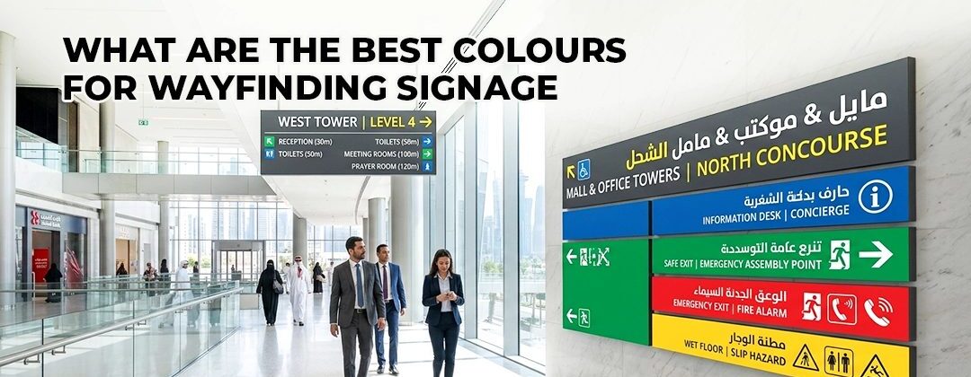
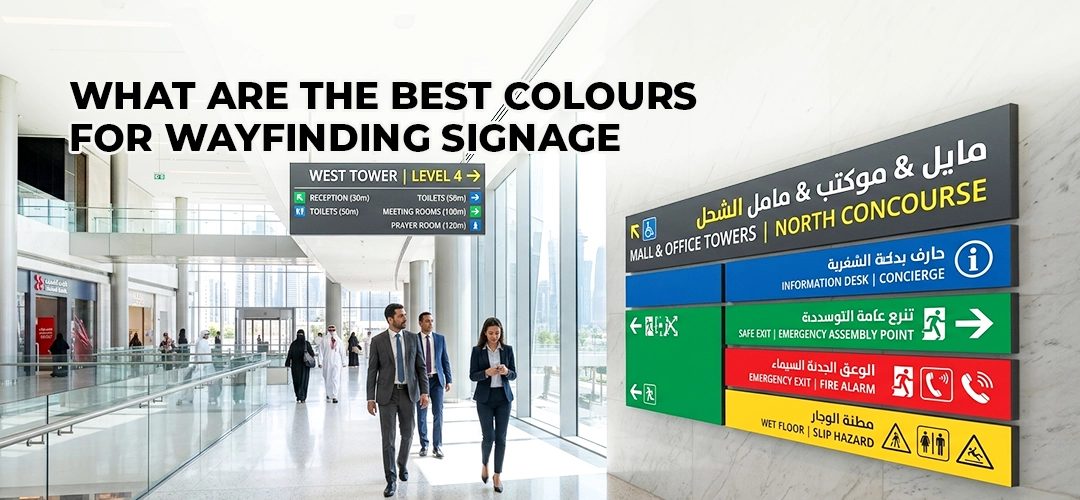
- Urgency: Using internationally recognised colours (red for danger, green for safe exit) to communicate critical safety information instantly.
- Brand coherence: Aligning wayfinding colours with the overall brand identity of the organisation.
The Principle of Contrast
The single most important rule in wayfinding colour selection is contrast. A sign that cannot be read at a distance, in poor lighting, or by someone with colour vision deficiency has failed its primary purpose.
Internationally recognised accessibility standards, including WCAG (Web Content Accessibility Guidelines) — which also inform physical signage best practices — require a minimum contrast ratio of 4.5:1 between text and background for normal text, and 3:1 for large text.
The highest-contrast combinations include:
- Black text on white or yellow background
- White text on black, dark blue, or dark green background
- Yellow text on black background (particularly effective for safety signs)
Our backlit sign boards and LED sign boards are produced with contrast-optimised colour combinations as standard for all wayfinding applications.
Colour Coding for Zone-Based Wayfinding
Large facilities — hospitals, universities, airports, and malls in Doha — often use colour coding to distinguish zones or departments. Each zone is assigned a distinct colour, and that colour appears consistently on all signage within that zone, allowing visitors to follow their colour through the building.
Best practices for zone colour coding:
- Use no more than six to eight distinct zone colours in a single facility to avoid overwhelming visitors
- Choose colours that are distinguishable by people with common colour vision deficiencies (avoid red-green combinations as the sole differentiator)
- Test colour combinations in the actual lighting conditions of the facility — colours that look distinct on a design screen can appear similar under fluorescent or LED building lights
- Use colour as a supplement to — not a replacement for — text-based wayfinding
Universally Recognised Wayfinding Colours
Certain colours carry universal meaning in wayfinding contexts. These conventions should be respected in all signage systems:
| Colour | Universal Meaning | Common Applications |
|---|---|---|
| Green | Safe, go, proceed | Emergency exits, safe routes, go-ahead |
| Red | Danger, stop, prohibited | Fire equipment, prohibition signs, hazards |
| Blue | Information, mandatory | Informational signs, mandatory instructions |
| Yellow / Amber | Caution, warning | Hazard warnings, wet floors, construction areas |
| White / Grey | Neutral, general information | Directional signs, general facility information |
Never use red for non-emergency directional signs, and never use green for anything other than safe-route or exit information. Departing from these conventions confuses visitors and can create dangerous misunderstandings in emergency situations.
Colour and Brand Identity
Many organisations want their wayfinding system to reflect their corporate or institutional brand colours. This is absolutely achievable — but requires careful management. Brand colours should be used for:
- Sign panel backgrounds in non-safety-critical wayfinding
- Accent colours on identification signs and room nameplates
- Headers, borders, and decorative elements
Brand colours should never replace the universally recognised emergency colour conventions. A hospital that uses red as its brand colour, for example, must still use red exclusively for fire safety signs — never for general departmental directional signs.
Speedline Media produces branded wayfinding systems that balance corporate identity with functional clarity. Our acrylic sign boards, 3D sign boards, and indoor signage solutions are available in any colour specification to match your brand guidelines.
Colour Considerations for Qatar’s Climate and Lighting
Qatar’s extreme sunlight and UV exposure can cause certain colour pigments to fade significantly faster than others. For outdoor wayfinding signs in Doha, always specify:
- UV-stable inks and pigments on all printed elements
- Powder-coated metal panels with UV-resistant topcoats
- UV-stabilised acrylic for any transparent or translucent elements
Colours that fade fastest in direct Qatar sunlight include certain reds, purples, and blues when produced with standard (non-UV-stable) inks. Always specify UV protection when briefing your signage supplier. Explore our outdoor signage solutions and sign board services in Qatar.
Speedline Media & Advertising
📍 Al Jazeera Street, Bin Mahmoud, Doha, Qatar